Comprehensive survey of visualization tools (DAGitty, Vensim, STELLA, etc.) and academic literature on causal diagram visualization, with assessment of current implementation against best practices. Identifies concrete enhancement opportunities including semantic zoom, node search, and SVG export.
Added `evergreen: false` frontmatter field to allow pages (reports, experiments, proposals) to opt out of the update schedule. Full feature implementation: frontmatter schema + validation (evergreen: false + update_frequency is an error), Page interface + build-data, getUpdateSchedule(), bootstrap/reassign scripts, updates command, staleness checker, PageStatus UI (shows "Point-in-time content · Not on update schedule"), IssuesSection (no stale warnings for non-evergreen). Applied to all 6 internal report pages. Updated automation-tools docs.
Causal Diagram Visualization: Tools & Best Practices
Executive Summary
This report surveys tools and techniques for visualizing complex causal diagrams, with applications to our AI Transition Model visualization. Key findings:
| Area | Key Insight | Relevance |
|---|---|---|
| Progressive disclosure | Start with 20-50 nodes, expand on demand | Already implemented via view levels |
| Semantic zoom | Detail level changes with zoom | Potential enhancement |
| Focus+context | Highlight paths while dimming irrelevant nodes | Implemented via path highlighting |
| System dynamics tools | Vensim, STELLA handle feedback loops well | DAG limitation noted |
| Academic research | Visual analytics for causal reasoning is active area | Multiple relevant papers |
Tools Survey
DAGitty - Browser-Based Causal Diagram Editor
URL: dagitty.net
DAGitty is a browser-based tool for creating, editing, and analyzing causal diagrams. Originally developed for epidemiology and statistics.
| Feature | Description |
|---|---|
| Graphical editor | Click to add nodes, drag to connect |
| Testable implications | Auto-generates statistical independence assertions |
| Adjustment sets | Identifies confounders for causal inference |
| Export | SVG, PNG, LaTeX/TikZ |
DAGitty focuses on statistical causality (d-separation, backdoor criterion) rather than systems thinking. Our diagrams are more about conceptual causal chains than statistical adjustment.
Example DAGitty diagram:

Vensim - System Dynamics Modeling
URL: vensim.com
Vensim is the industry standard for system dynamics modeling, supporting both causal loop diagrams (CLDs) and stock-flow models.
| Feature | Description |
|---|---|
| Causal Tracing® | Click any variable to see full causal chain |
| Feedback loops | First-class support for reinforcing/balancing loops |
| Simulation | Run models forward in time |
| Large models | Handles 1000+ variable models |
| SyntheSim | Real-time simulation during editing |
Our current implementation uses Dagre (DAG layout) which doesn't support cycles. Vensim's strength is handling feedback loops, which are common in real systems but create layout challenges.
Key insight: Vensim's Causal Tracing® feature (highlighting upstream/downstream paths) directly inspired our path highlighting implementation.
STELLA - Systems Thinking for Education
URL: iseesystems.com
STELLA (from isee systems) focuses on accessible systems thinking, with strong visualization for feedback loops.
| Feature | Description |
|---|---|
| Causal Loop Diagrams | Polarity indicators (+/-) on edges |
| Loop identification | Auto-detects reinforcing vs balancing loops |
| Storytelling | Step-through presentations of model behavior |
| Web publishing | Share interactive models online |
KeyLines - Commercial Graph Visualization
URL: cambridge-intelligence.com/keylines
KeyLines is a commercial JavaScript SDK for graph visualization, used in intelligence analysis and fraud detection.
| Feature | Description |
|---|---|
| Time-based visualization | Animate graph changes over time |
| Clustering | Auto-group related nodes |
| Link analysis | Find shortest paths, betweenness |
| Scale | Optimized for 10K+ nodes |
KeyLines requires licensing. However, their demos and documentation provide good inspiration for features.
Demo gallery: cambridge-intelligence.com/demos
yFiles - Enterprise Graph SDK
URL: yworks.com/products/yfiles
yFiles is a comprehensive graph visualization SDK supporting multiple platforms.
| Feature | Description |
|---|---|
| Large graphs | Handles 100K+ nodes with WebGL rendering |
| Organic layout | Natural-looking layouts for complex graphs |
| Incremental layout | Smooth animations when graph changes |
| Grouping | Nested/compound node support |
Relevant demo: yFiles Knowledge Graph Demo - Shows hierarchical ownership relationships similar to our causal chains.
Kumu - Systems Mapping Platform
URL: kumu.io
Kumu is a web-based platform specifically designed for systems mapping and stakeholder analysis.
| Feature | Description |
|---|---|
| Causal loop diagrams | Native support with polarity |
| Decorations | Color/size by data attributes |
| Collaboration | Multi-user editing |
| Embedding | Embed maps in other sites |
Example map: Kumu Climate Change Map
Loopy - Interactive Causal Loops
URL: ncase.me/loopy
Loopy is a minimalist tool for creating playable causal loop diagrams, created by Nicky Case.
| Feature | Description |
|---|---|
| Playable | Drag nodes to simulate changes |
| Simple | No learning curve |
| Educational | Great for explaining feedback loops |
Loopy's "playable" diagrams where users can drag variables to see effects propagate is an interesting interaction model we could explore.
Academic Literature
Visual Analytics for Causal Analysis
"A Visual Analytics Approach for Exploratory Causal Analysis" (IEEE VIS 2020)
- Focus+context views for navigating large causal graphs
- Aggregation of similar causal paths
- Interactive refinement of causal hypotheses
"Visual Analysis of Multi-outcome Causal Graphs" (2024)
- Handling multiple effect variables
- Path comparison across outcomes
- Uncertainty visualization in causal relationships
Temporal Causality
"DOMINO: Visual Causal Reasoning with Time-Series Data" (IEEE TVCG 2022)
- Progressive drill-down from overview to detail
- Temporal lag visualization
- Granger causality integration
LLM-Assisted Causal Modeling
"CausalChat: Interactive Causal Model Development" (2024)
- Natural language interface for building causal models
- LLM suggests variables and relationships
- Human-in-the-loop refinement
LLM-assisted causal modeling is an emerging area. Our /cause-effect-diagram skill already uses this pattern - could be extended further.
Best Practices for Large Causal Graphs
Progressive Disclosure
| Level | Node Count | Features |
|---|---|---|
| Overview | 5-10 | High-level categories only |
| Expanded | 20-50 | Subcategories visible |
| Detailed | 50-200 | All individual factors |
| Full | 200+ | Complete model (rarely needed) |
Our implementation uses four levels: Overview → Interactive → Expanded → Detailed.
Semantic Zoom
As users zoom in, progressively reveal more information:
| Zoom Level | Shows |
|---|---|
| Far | Node shapes only, no labels |
| Medium | Labels appear |
| Close | Descriptions appear |
| Very close | Full metadata, inline charts |
ReactFlow supports custom zoom-dependent rendering. We could hide descriptions at low zoom and show them at high zoom.
Focus+Context
When a user selects a node:
- Highlight the selected node and its causal path
- Dim (but don't hide) unrelated nodes
- Thicken edges in the causal chain
- Show edge labels on highlighted paths only
Our path highlighting implementation follows this pattern.
Handling Scale
| Technique | When to Use |
|---|---|
| Clustering | Group related nodes into expandable clusters |
| Fisheye distortion | Magnify focus area while compressing periphery |
| Mini-map | Always-visible overview for navigation |
| Search/filter | Let users find specific nodes |
| LOD rendering | Reduce detail at low zoom |
Comparison: Our Implementation vs. Best Practices
| Best Practice | Our Status | Notes |
|---|---|---|
| Progressive disclosure | ✅ Implemented | 4 view levels |
| Expand/collapse clusters | ✅ Implemented | Interactive view |
| Path highlighting | ✅ Implemented | Click to highlight |
| Mini-map | ✅ Implemented | Expanded/Detailed views |
| Edge labels on hover | ✅ Implemented | Shows effect direction |
| Semantic zoom | ⚠️ Partial | Could add zoom-dependent detail |
| Feedback loops | ❌ Not supported | Dagre requires DAG |
| Temporal animation | ❌ Not implemented | Could show evolution |
| Search/filter | ❌ Not implemented | Would help at scale |
| Fisheye distortion | ❌ Not implemented | May not be needed |
Potential Enhancements
Based on this research, potential future improvements:
High Priority
- Semantic zoom - Show/hide descriptions based on zoom level
- Node search - Filter or highlight nodes matching a query
- Export to SVG/PNG - For presentations and reports
Medium Priority
- Loop annotation - Mark known feedback loops in description even if not rendered
- Time-based views - Show how causal relationships evolved
- Comparison view - Side-by-side different model versions
Lower Priority
- Fisheye lens - Magnify focus area (complex UX)
- 3D layout - For very large graphs (accessibility concerns)
- Playable simulation - Loopy-style "what if" exploration
Links & Resources
Tools (Free)
- DAGitty - Statistical causal diagrams
- Loopy - Playable causal loops
- Kumu - Systems mapping (freemium)
Tools (Commercial)
- Vensim - System dynamics (free PLE version)
- STELLA - Systems thinking
- KeyLines - Graph viz SDK
- yFiles - Enterprise graphs
Academic
- IEEE VIS Conference - Top visualization venue
- Causal Inference in Statistics - Pearl's textbook
Our Implementation
- Master Graph Viewer — planned
- Cause-Effect Style Guide - Our conventions
- Source:
src/components/CauseEffectGraph/
Live Demos & Examples
Our Implementation
Try these views of the AI Transition Model:
| View | URL | Features Shown |
|---|---|---|
| Overview | Master graph (planned) | High-level categories |
| Interactive | Master graph interactive (planned) | Expandable clusters, path highlighting |
| Expanded | Master graph expanded (planned) | Subcategories as nodes, mini-map |
| Detailed | Master graph detailed (planned) | All factors (160 nodes) |
External Tool Demos
| Tool | Demo Link | What to Notice |
|---|---|---|
| DAGitty | dagitty.net/dags.html | Causal path coloring, adjustment sets |
| Loopy | ncase.me/loopy | Playable simulations, simple interface |
| Kumu | Hawaii Missile Crisis Map | Rich node decorations, clustering |
| KeyLines | Cambridge Demos | Time-based, large-scale graphs |
| yFiles | Organization Chart Demo | Hierarchical layouts, expand/collapse |
Example Causal Diagrams
Systems Dynamics Examples:
- Limits to Growth Model - Classic world model on InsightMaker
- Beer Game - Supply chain dynamics
- Predator-Prey - Classic feedback loop example
Causal Inference Examples:
- DAGitty Examples - Confounding, mediation, selection bias
- ggdag R Package Gallery - Statistical DAG examples
Appendix: Tool Screenshots
Our Implementation - AI Transition Model
The interactive master graph view showing expandable clusters and causal connections between AI factors and outcomes.
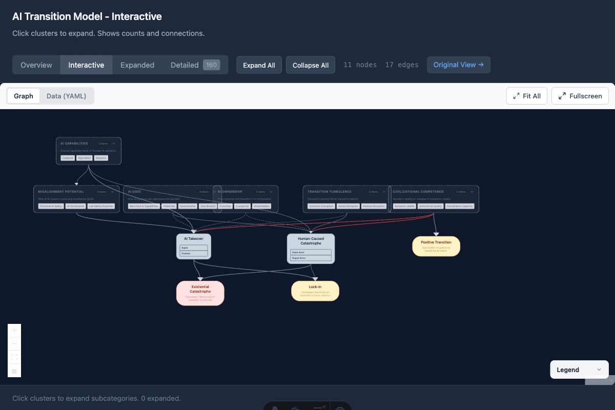
Features shown:
- Expandable cluster nodes (AI Capabilities, Misalignment Potential, etc.)
- Color-coded outcomes (Existential Catastrophe, Lock-in, Positive Transition)
- Edge styling indicating relationship types
- Expand All / Collapse All controls
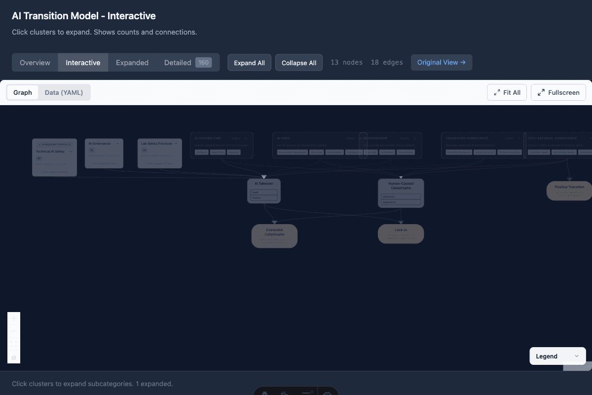
With a cluster expanded (Misalignment Potential → Technical AI Safety, AI Governance, Lab Safety Practices):
DAGitty Interface
The DAGitty editor showing a causal diagram with exposure (E), outcome (D), and confounders. Note the automatic identification of adjustment sets and testable implications on the right panel.
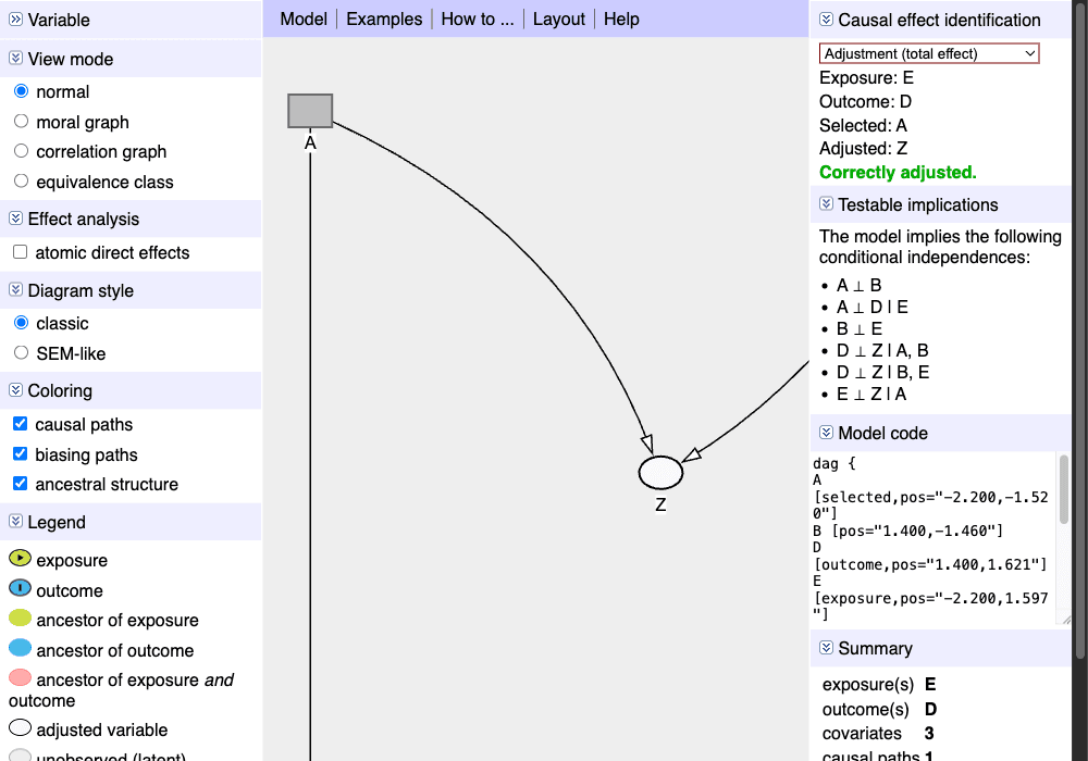
Key features visible:
- Variable type indicators (exposure, outcome, ancestor)
- Causal path highlighting (green line from E to D)
- Statistical independence implications
- Model code export
Loopy Interface
Loopy uses a simple sketch-based interface where users draw nodes (circles) and connections (arrows). The key innovation is that diagrams are "playable" - drag a node up/down to see effects propagate through the system.
Key features:
- Direct manipulation (drag nodes)
- Polarity indicators (+/-) on edges
- Real-time simulation
- Zero learning curve
Vensim Causal Tracing
Vensim's Causal Tracing® feature allows clicking any variable to highlight its entire causal ancestry. This directly inspired our path highlighting implementation.
Key insight: The ability to trace "what affects this variable" is crucial for understanding complex models. Our implementation uses BFS to find all upstream and downstream nodes.
Note: Vensim is desktop software - visit vensim.com to download the free PLE version.
Kumu Systems Map
Kumu specializes in stakeholder and systems mapping with rich decoration options:
- Node size by importance/influence
- Node color by category
- Edge thickness by strength
- Clustering and grouping
Example: Hawaii Missile Crisis Stakeholder Map - visit this live example to see Kumu's interactive features.
References
- Pearl, J. (2009). Causality: Models, Reasoning, and Inference. Cambridge University Press.
- Sterman, J. (2000). Business Dynamics: Systems Thinking and Modeling for a Complex World. McGraw-Hill.
- Wang, J. et al. (2020). "A Visual Analytics Approach for Exploratory Causal Analysis." IEEE VIS.
- Zhang, Y. et al. (2022). "DOMINO: Visual Causal Reasoning with Time-Series Data." IEEE TVCG.
- Kim, S. et al. (2024). "Visual Analysis of Multi-outcome Causal Graphs."